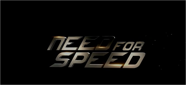
Firstly, the typography is presented in a serif typeface, this is clear as the letters have a slight projection off the stroke of letters, like, for example, Times New Roman. This provides enormous clarity and the use of lowercase letters provides a neat square in which the text has been presented to add simplicity and a nice aesthetic to the typography. This font also has a fixed pitch and as the screenshot shows, it contains a mix of both uppercase and lowercase letters, however, in the words 'Need' and 'Speed', contain uppercase letters which are the same in terms in sizing. The font fades in via a good flutter of specs similar to that of a wielding machine during use, this is a symbolic way to show the mechanics behind how a car is made and give the film a feel and channel the theme of the film in the typography.
The font is a grey colour presented to the audience on a black background which has a gold shining on certain letters. Grey is a neutral colour which often presents connotations and feelings of depression and loss, according to key psychological studies. However, it is also regarded as a sophistication and formality. So the production team is trying to balance this neutrality and sophistication with the shining of gold which connotes wealth and beauty of the cars used in this action thriller. So the typography of this allows a neutral atmosphere that doesn't give to many hints and surprises regarding the rest of the film. Also, the grey matches the wheels of the cars, so at this stage, it's about reflecting the main theme and focus point of the film, and that's cars, which is also reflected with in this typography.
The placement of the text is interesting in respect that its placed in the centre of the screen on a black background, it is almost an example of reserve type, but the letting of the typeface is placed in a way that makes it stand out and easy to read for the audience. There is a slight rotation as the font is presented and this reflects when grey smoke comes out of the exhaust and this is reflected with in this movement of the font.
In summary, I think this is a cleverly constructed and thought out piece of Typeface, and with all the connotations and atmosphere it creates presents a nice piece of contrast to the film which is a fast paced action thriller involving cars, guns and fights. The typography is simple but effective but also provides connotations which are clever and relevant. It's a wonderful piece of typography.

In the opening sequence to Mission Impossible 4, the audience are shown to two sparks following a piece of rope, which is what is responsible for the orange tinge to this piece of typeface. The typeface itself is in block capitals which are all the same point size. In terms of what type this typeface is, its a Sans Serif font, which is different to the example seen previous as it has no serifs and is easier to read as it has no finishing projection.
Already from the opening title sequence the director, Brad Bird, is already connoting danger through the introduction of two fuse wires complimented with the iconic soundtrack of the Mission Impossible series, so there is a sense of danger from the start as well as a familiar piece of sound to play alongside the fizzing of the fuse wires. These two fuse wires cross each other to reveal the typeface and the orange provides connotations of fire and danger, could this foreshadow an explosive entrance for main character Ethan Hunt? Orange also connotes a fiery atmosphere or a lustful feeling so could Hunt be in lust of something? A psychological study into the colour orange says that orange is relating to danger and adventure, so in that respect, the colour of the typeface matches the intentions and sub genre of the film.
The connotations of the typeface is one that mirrors the sub genre of the film, the fuse wires match the danger and action that is going to be experienced by Ethan Hunt, and the colouring is used to match this. The typography is only presented on screen for a short period of time, as the fast paced title sequence is used to match the fast pace at which the film is going to be set. The involvement of a fuse wire suggests to the audience that there is dynamite somewhere waiting to be blown up, so it's important for introduction but maybe a starter to the narrative of the film.
In summary, this font helps set up the film and lets everybody aware that this is an action film that, although part of a series, stands away as an individual film, and the fast pace matches the sub genre it is being placed in.
This is a good start - you include some thoughtful analysis of two title sequences. (How) are the titles integrated into the opening sequence? Can you include analysis of at least one more thriller title sequence?
ReplyDelete